Content design

Optimising prescription workflows for pharmacy teams

I designed the content layer for a new prescription management system that would allow pharmacists and customer service agents to have a clearer, more transparent view of patient histories.

Content design
Workflow design
Digital health
Workflow design
Overview

Giving pharmacy staff a full picture of their patients

Well Pharmacy is one of the UK’s largest independent pharmacy retailers, with both digital and in-store services available.

‍

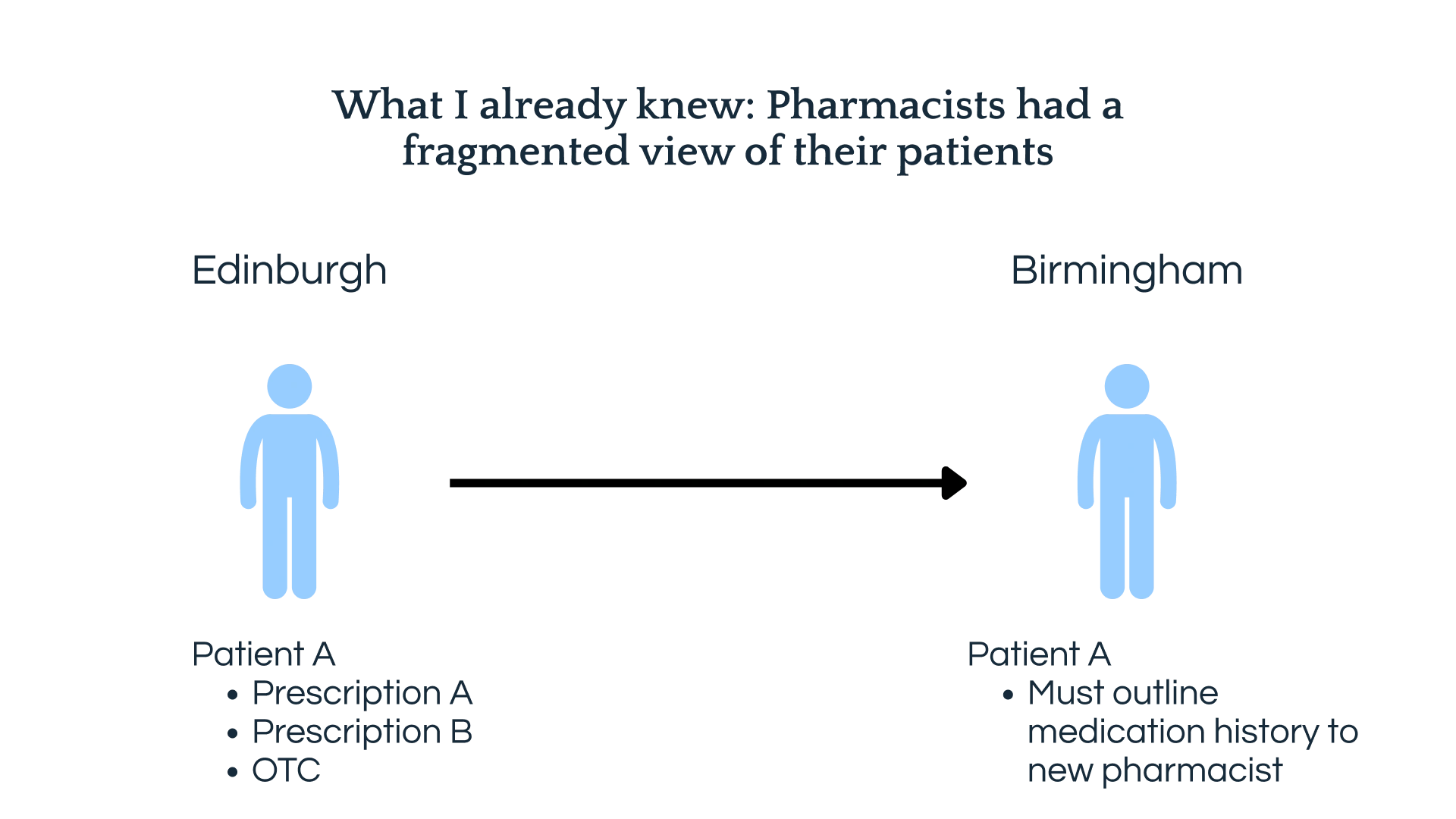
While patients could access prescriptions, services and support in both environments, pharmacists lacked a full view of their history. An in-store pharmacist could only ever see the prescriptions processed there. So, if a patient ordered medicine online, had a prescription issued in a brick-and-mortar store and then recently moved into a care home, the information about this existed in silos.

‍

The business wanted to decommission this legacy system and introduce a single platform to help pharmacists and customer service agents better manage patient needs and expectations. 

‍

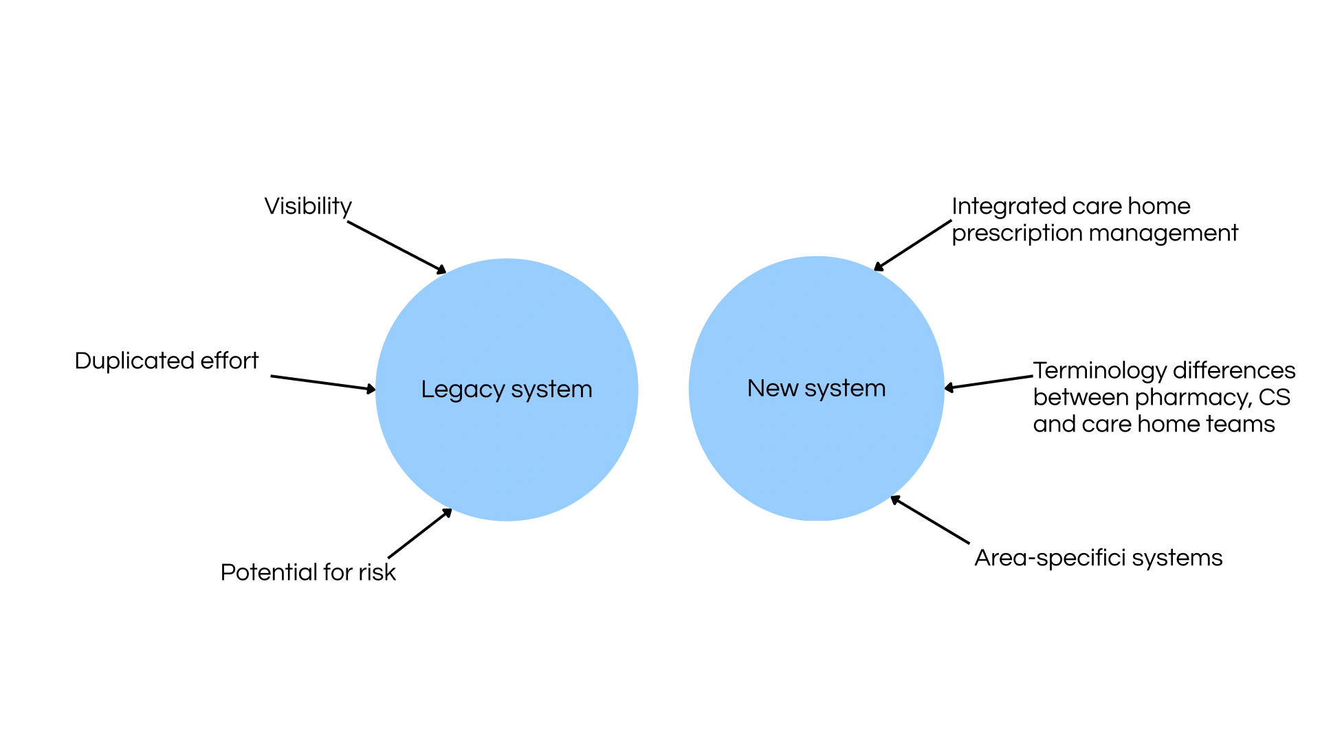
An additional factor was that care home services would be integrated into this platform. Historically, this segment of the business had been managed by a team independent of the digital and in-store teams. They had their own terminology and processes.

‍

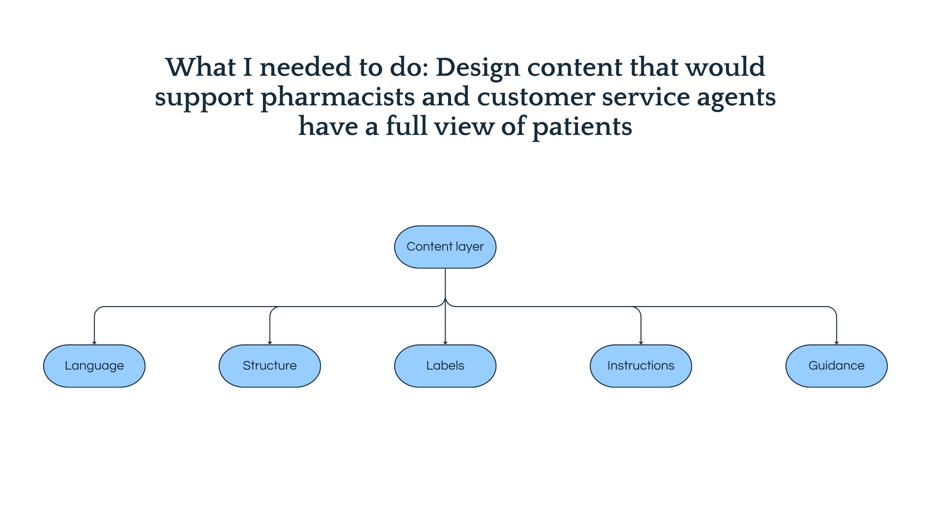
I design the content that would help in making the new platform feel cohesive. It included the language, structure, instructions and guidance that would make it usable for teams who had previously operated in different ways from one another.

‍

A patient from Edinburgh would have to explain the prescription history to a pharmacist in Birmingham because of the data silos in the system.
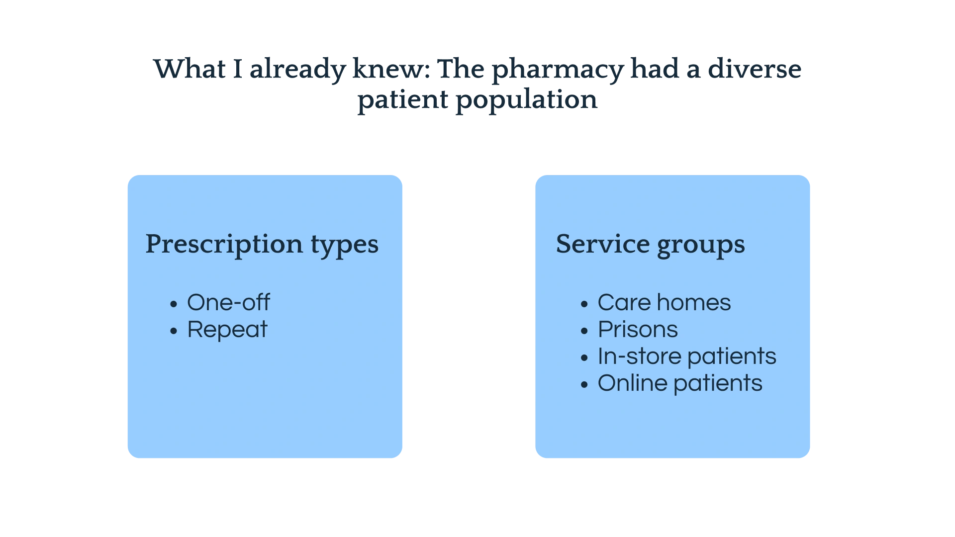
The pharmacy had a diverse patient population. Some were repeat prescription customers while others were one-off patients. The pharmacy offered its prescription management services to its online as well as to people  in-store, in care homes and prisons.
The content layer necessary to provide clear instructions, guidance and messaging to pharmacists, customer service staff and the care homes team.
Key outcomes

16,500+

Care home residents supported by the pharmacy across the UK

100k+

Care home prescription items processed every month

600+

Care homes served across the UK — the first cohort in scope for the new platform

Challenge

Handling care homes integration: patients with complex needs and prescription histories

Stakeholders within the business wanted to prioritise the inclusion of care home services into the new platform. This was because patients in this cohort represented a significantly higher proportion of repeat prescriptions than any other patient group. This meant that they generated a higher order volume than others.

‍

Their team, as mentioned, had their own established language and processes that needed to be accounted for and considered in the development of the new system’s content.

The differences between the legagcy prescription order system and the proposed new one.
My thinking

Working with the people who already knew the language

During the discovery phase I worked closely with product, clinical, and customer service colleagues to understand the specific friction each team was experiencing with the legacy system. It was important not to assume the problems looked the same from every angle. For example, a pharmacist's experience was different from a customer service agent's, and both were different again from a care home coordinator's.

‍

From these sessions, a set of content priorities emerged:

‍

  • Establish a single, consistent terminology for care home-specific concepts drawing from the language the care homes team already used
  • Design error states and confirmation dialogues that communicated real consequences, not generic warnings
  • Create patterns for surfacing cross-channel prescription history without overwhelming users who had never seen it before
  • Write inline guidance for users to unfamiliar parts of the system without requiring them to leave the screen

‍

I worked alongside the UX designer in Figma, writing content directly into prototypes rather than in a separate document. This made it easy for clinical reviewers and care homes leads to comment on the actual interface in context.

My approach

A terminology framework, not just a style guide

The content produced was a framework to support all teams who would interface with the platform. It covered care home terminology (groups, units, residents, labelled medication), prescription statuses, workflow language for cross-channel views, and the language for irreversible actions.

‍

For irreversible actions in particular, the content needed to do more than confirm intent. When an action couldn't be undone and when the downstream implications were real, the confirmation UI named exactly what would happen and why it mattered. It was enough to produce prompts that were generic, like "Are you sure?" because they didn’t effectively explain the knock-on consequences of the decision. More explicit and clear messaging was needed to support conscious decision-making.

‍

The final screens were reviewed with the Customer Service Lead, the Care Homes Lead, and a representative group of pharmacy staff before release.

Learnings and reflections

A platform that works for all takes into account the opinions of many

Working with teams across functions helped to create a single platform that was usable without a learning curve

The interface has to do the onboarding work

When a system introduces people to an unfamiliar part of the business, the content can't assume prior knowledge. Every label, heading and instruction has to orient as well as inform — particularly when users are competent professionals stepping into a new context, not beginners learning from scratch.

Terminology work is governance work

Establishing a shared language from the care homes team's existing vocabulary wasn't just about consistency on these screens. It built a foundation for how the business would refer to this part of its operations going forward — reducing ambiguity in communications, training materials and future product work.

Irreversibility deserves its own content pattern

Generic "are you sure?" prompts don't communicate consequence. When an action can't be undone — and when that has real operational implications downstream — the confirmation content needs to name exactly what will happen and why it matters. That specificity is what makes users genuinely pause rather than click through.

Simplicity at scale requires cross-functional buy-in

The content only works if the right people have reviewed it. Involving the Customer Service Lead, Care Homes Lead and pharmacy staff in screen reviews wasn't a sign-off exercise — it was how we found the gaps between what the system said and what users actually needed to hear.

More case studies